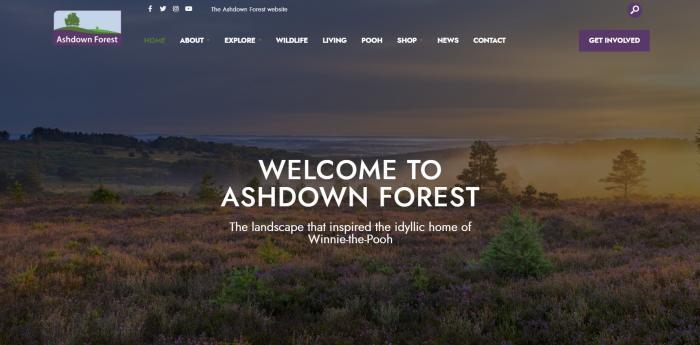
We’ve just finished work on a lovely website, of which we are very proud.
Not just because we designed, wrote and built it, but…
Because it’s for a wonderful organisation, which looks after one of Britain's most iconic landscapes.
Ashdown Forest, in the south of England, is the legendary home of Winnie-the-Pooh.
The area helped to inspire those beautiful stories which are a part of some many of our childhoods.
Hence our warm fuzz of nostalgic happiness!
Anyway, before we get even more misty-eyed, the point of this blog is how very alike the art of the journalist and website writer are.
A question for you:
In a newsroom, what's often seen as the most important job?
The one the most talented journalists tend to get?
It’s not being the editor, the presenters, not even the reporters…
- It’s the headline writers
Why? Because without striking and alluring headlines, and images to match, no one reads the paper, or watches the news programme.
Which means that all the rest of the work could be wasted.
Likewise with websites:
Unless you grab the attention of the reader immediately, they'll just click on to the next site.
There's far too much out there to explore to waste time trying to work out why they should hang around.
Which is why the headline and images on the Ashdown Forest site were so important.
We wanted to get the Winnie-the-Pooh hook in right at the start...
And use a series of pictures to rotate along with that to show off the wonders of the Forest.
The principle of headline words and images is just the same if you're producing an effective website for a business.
On our own Creative Warehouse site, for example, it’s a similar story:
Hopefully a stylish and enticing Cambridge backdrop, and our big hook, the heart of what we do:
- All your communication problems solved with style
The idea is to grab the visitor in an instant, and lure them further into the site.
You’ve got to sum up what's most important and appealing about your story, why anyone should be interested, and in only a few words.
And also find an image which captures the attention.
But then don’t forget…
What’s the next most important part of a news story or website, after your headline and best images?
The answer is...
- The opening line
In order to continue building a reader’s interest, so you keep drawing them further into the site, or story.
For Ashdown Forest, it's:
- A treasure of the English countryside, enchanting with its wilderness and beauty
For Creative Warehouse:
- If you need the world to know about the great things you’re doing, we’ll make it happen
By which time, if you’ve got the headline, image, and opening right, you should pretty much have achieved your aim.
The reader is happily hooked and exploring away.
Whether you're producing a news story or a website.
That's not the end of your work, of course.
Don’t forget the layout.
You don't want to put a reader off with big chunks of dense text.
Images are critical for this, along with the use of headings, italics, or bullets, and that often overlooked, but wonderfully effective weapon in your armoury of appealing layouts...
- White space
All are also excellent for elegance and readability, critical factors in the user experience.
Once again, that goes for whether it’s for a newspaper or a website.
So for a great website, think like a journalist.
Or for good journalism, think like a website writer.
If you need help with either, please get in touch.
And if you want to see more of the sites I've mentioned, here's Creative Warehouse, and this is Ashdown Forest.
