Domino Printing was approached by Procter and Gamble (P&G™) to work together on inclusive packaging for one of its Herbal Essences bio:renew range of shampoos and conditioners.
Together with her colleagues, P&G’s Special Consultant for Inclusive Design, Sumaira Latif, who is registered blind herself, came up with the innovative idea of including tactile notches onto the existing bottles to enable them to be easily differentiated by touch.
Using Domino’s D-Series CO2 laser coders to etch the markers during production seemed the optimal solution, but without compromising the packaging or significantly impacting production line speeds, which process hundreds of bottles every minute.
The decisive factor in choosing Domino was its scientific expertise and highly collaborative and iterative design testing to uncover the best solution for the inclusive bottle design.
The P&G team was invited to visit Domino’s specialist laser testing labs in Hamburg, initially to discuss the requirements for the project, and then again for a two-day working session to identify the best possible solution.
Dr Stefan Stadler, Team Lead at the Domino Laser Academy says: “The initial brief from P&G was for coding the bottles with triangle, circle and square symbols and from initial testing it was felt that these symbols would be difficult to distinguish by touch so we presented some different options which could be more easily differentiated.”
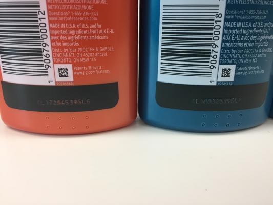
The chosen design features a row of raised lines on the bottom of the back of the shampoo bottles with two rows of raised dots in the same place on conditioner bottles.
The key to the project’s success was ensuring that the laser did not puncture the bottles or weaken the barrier strength of the substrate. The Laser team identified the bottom of the bottle, where the plastic is at its thickest, as the best location for the coding, where it would be easily identifiable without compromising the integrity of the packaging.
Sumaira Latif concludes: “Most people with visual impairments cannot read Braille – it takes months, if not years to learn, and really you have to start young to develop the sensitivity. In addition, many people develop visual impairments in later life, and Braille is no longer an option. It was important that we invented a feature which could be universally recognised and would work for people who haven’t had the opportunity to learn Braille.
“By choosing a simple, more universal approach to differentiate the bottles, P&G hopes to make the bottle more accessible, not just to those with a visual impairment, but for anyone who may struggle to tell the products apart during use.”
Based on the success of the initial trial, P&G has rolled out the new inclusive design across all its US range of Herbal Essences bio:renew shampoos and conditioners.