The Problem
Helen and Alessandra worked tirelessly to define Audiens’ company values - a startup only a few years old.
They’d surveyed every employee and laboured over the answers, simplifying the collective motivation into three short values the team (and future team) could rally behind.
They hit gold: 🌟

But not everyone was on board with their vision.
Aside from repeating them every meeting, it became apparent fast that getting the whole company to remember, and therefore live the values, was… tricky.
So they approached me for help.
If we could visualise the values in some way…
Creating A Character
My first step was to bring character to the company logo - separating out the ‘i/o’ which made an ‘a’ for audiens.
Early on, I’d decided this should be an eye, with the green element making up any additional graphics.
The brand guidelines had an element of transparency, which turned any green and blue overlapping element into a dark turquoise, so I was keen to build this into an editable format in After Effects.
With the ‘eye’ ready, I set off sketching ideas, and drawing up concepts.
Let’s take a look at the results.
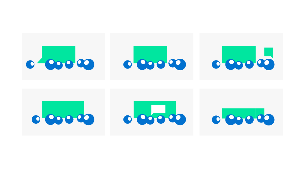
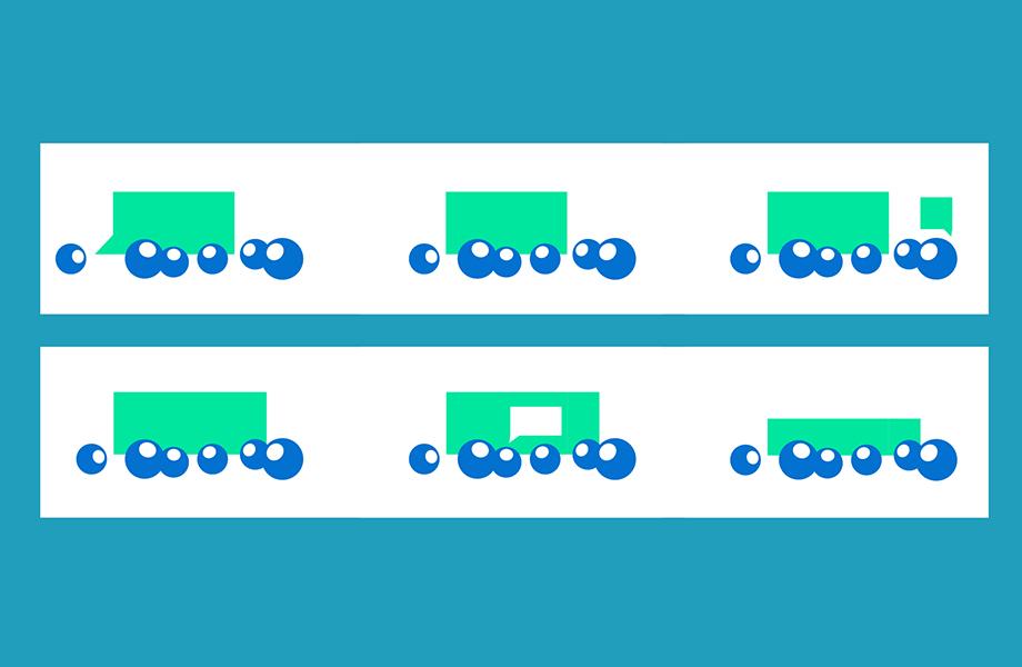
Value 1: Feedback To Move Forward
This went through a few variations until the final visual stuck.
Initially, I thought we’d have one character give an idea, one would add to it, and another would cut it down, until we ended on an edited idea everyone agreed with.
Except, that’s not what it looked like.

It represented every horrible meeting where no one leaves happy - compromises have been made from everyone.
Instead, the final animation focused on seeing everyone get a say, whether big or small, and those ideas combine to create a cohesive idea.
It felt way more natural, and was more fitting of the value.
Value 2: Test And Learn
This was a tricky one to portray.
Without drawing 100 products tested on an audience of 10K, how do you show trialing new products and learning from the results?

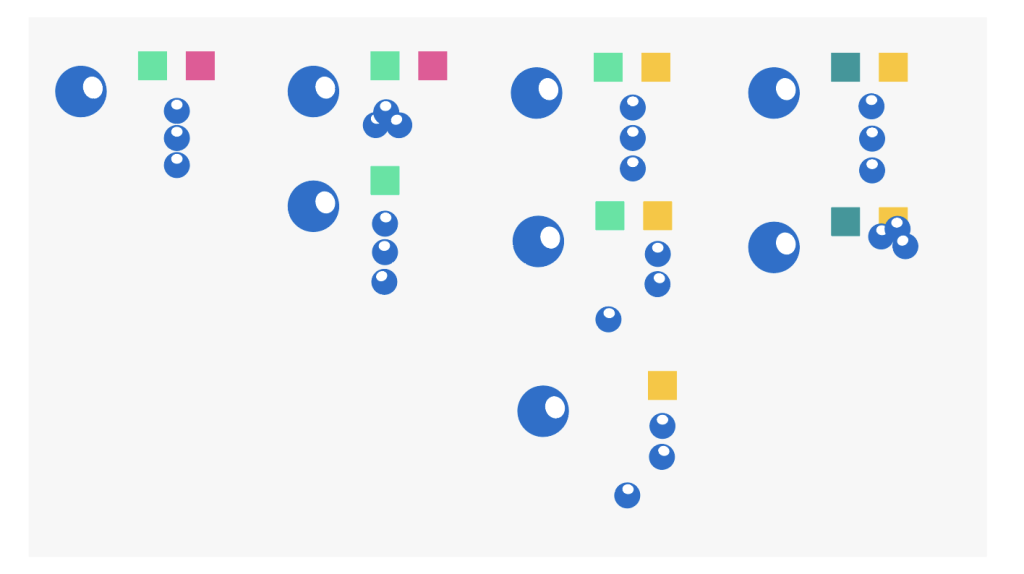
To keep things simple, I used the brand colours for different boxes that’d represent variations in the product, and our eye character to represent the customer.
We essentially show a democratic voting process at pace.
With each variation of the product the audience decides they prefer, a new option is given, and the voting happens again until all three eyes are decided on one.
Value 3: Get S*** Done
Perfectionists don’t survive in startups.
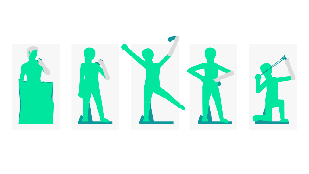
To visualise this value, I designed two 2D models of Michelangelo’s David:
🗽 one detailed,
🗿 the other simplified.

Once I had the limbs in an editable setup, David could be adjusted into extra poses to link this value to ‘Test and Learn’ - if you get the get stuff done, you can move on to test variations and see what sticks.
Keeping the values relevant
Most importantly, these animations were repurposed so all teams would use them:
1) A longer version was pieced together to show to new recruits.
2) Each was turned into a GIF to share in Powerpoint presentations.
3) Slack emojis were created, so the values would visually enter company chats. 😄🗽🎷
Need to bring your values to life?
Struggling to implement your company values?
Let’s talk about how I can help bring your values to life in one week.


