Simon writes:
A new and nasty habit is creeping into presentations, according to several experiences I’ve had lately.
I’m not the sort of person to be an absolutist.
Public speaking and presentations is an art, and there are very few rules.
But on this occasion, I’m going to be absolutistly absolutely clear…
This really is something you shouldn’t do.
What is said horror show, you are now doubtless asking yourselves.
Or asking me, more to the point!
It comes down to two critical factors:
- Modern attention spans, and engaging your audience with your character
First of all, attention spans.
The average duration these days is disputed, but it is undoubtedly short.
Next time you go to a talk, watch what happens if the presenter doesn’t grab the audience from the first few seconds.
Out will come the phones, and away will drift the attention.
Likewise, if the speaker doesn’t seem particularly authoritative, credible, interesting or entertaining…
You can also see people rapidly zoning out.
Which brings me to this modern fad that makes me itch.
Because it’s a big fail on both counts.
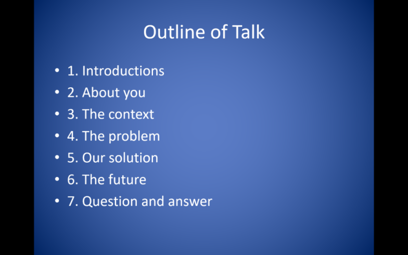
Increasingly lately, I've seen presenters set out a menu, or table of contents at the start of a talk.
This kind of thing (a slide which is wrong for so many reasons):
Accompanied by a riveting (not) commentary, such as:
We will start with blah blah blah…
Then move onto dull, boring pish…
And conclude with uninteresting, and unentertaining unhappiness.

That might be an exaggeration (you know me), but you get the point.
For the sake of my sanity, and audiences everywhere, can I please make a plea…
– To see no more, none, not a bit of this
The start of a presentation is the most important part.
Hook your audience with a revelation regarding what you’re going to be talking about…
Impress them with your authority and character…
Wrap them up in your story, and don’t give them a chance to disengage.
But however, and whatever you try...
- Do not recite a menu - it's deadly
Yours, with this public service message on the art of presentations!


